11.22.2013

south dakota

Yesterday I had the pleasure of visiting the Oscar Howe Gallery at the University of South Dakota in Vermillion.  The current exhibition, Dance of the Warrior, included highly stylized images of horses, warriors and spirits rendered in pure-flat shapes of color punctuated by fluid-dashed marks.  There were some tempera paintings and a wonderful drawing on display - but for the most part the work was done in casein paint.  Unfortunately, photography isn't allowed in the gallery.  So here are some links to the gallery and to Howe's Wikipedia entry where you'll be able to see some representative images of his work.

My favorite piece of the day was "War Dancer."  It was the only purely abstract painting in the show.  The colors, the intimate size and the lyrical nature of the shapes as they interacted with one another intrigued me.  As with the others, it had both an atomic feel and a primal vibe.  The negative space all in a velvety-matte black was perhaps what first drew me to this little gem.  Deep space cradling dancing-luminous shapes made for a sweet take-home memory.

This morning I woke up and made this little painting of a cow creamer - no doubt inspired by my trek to South Dakota.

Creamer on Black; casein on mounted paper; 10" x 8"; Mary Nagel Klein

11.08.2013

hallowed cow

Creamer in Oranges and Blues; 10" x 8"; casein on paper; 2013 Mary Nagel Klein

The cow returns.

The oranges are a nod to the cavity which took several layers of orange and blue and burnt sienna to achieve its sense of depth.  And the blues are the color of white - this time - and the color of cream - sometimes.

I love painting suspended vessels.  In addition to depicting gravity with its implied potential energy, hanging vessels also highlight the act of containment.  Exactly what they contain is often a mystery.  One might assume that a cow creamer, with its opening facing downward, contains nothing but air - a hollow hallowed cow.

11.01.2013

jug detail

Here's a close-up of the previous post's painting - and an opportunity to see the jug a bit differently.

Water Jug and Oranges (detail); casein on paper; 27.5" x 17"; 2013 Mary Nagel Klein

10.30.2013

water jug

This is my first painting of this little jug.  I found it at a resale shop and bought it thinking it might be right for a painting.  It's a heavy little thing - only about 5 inches tall but sturdy and solid.  That lent to thoughts of weight and balance more so than with my lighter models.  With this piece I feel like I'm entering new territory - uncharted waters while making the map as I go.

Water Jug with Oranges; casein on paper; 27.5" x 17"; 2013 Mary Nagel Klein

10.26.2013

why casein

In a comment on the previous post, Olga wrote, "Can I ask, by the way, why you use casein? Is it a simple case of you like the effect?"

Her questions gave me pause, the chance to gather my thoughts on the subject and to pull together some of the references I've been using lately.  Thank you, Olga.

Casein fine art painting was first introduced to me, and to many other contemporary artists, by James Gurney on his blog, Gurney Journey.  I hadn't thought about milk-based paint as an artistic medium until I saw a painting Gurney did of a chrome creamer at a restaurant booth in only black and white casein.  I was quite smitten by this little painting - Gurney's work is amazingly compelling and sincere.  His blog has a lot of posts dedicated to the medium with some great information on tools and materials.  I picked up a lot of useful tips there that got me started.

Timing was important with my switch too - I was ripe for change.  I had made a firm and deliberate decision to stop painting with lead white oil paint (for all of the obvious reasons) and had begun experimenting with alternative whites.  But oil painting wasn't the same without my favorite white. I really was spoiled and was finding it hard making the change. In the middle of that struggle, in the middle of last June, an alternative solution presented itself.  The time was right for me to give a new medium a serious try.

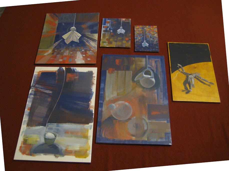
Since July 8, 2013, I've made 15 casein paintings (with Richeson Casein - The Shiva Series) and have read numerous books, posts and articles about the medium. Finding those references wasn't easy.  Here's a crop of a cover of one of the books I eventually did find:


It's a Walter Foster how-to book from who-knows-when (there is absolutely no date in it - I've checked and rechecked and even had a close friend search for it.)  I'm guessing it's from the 50's or 60's.  See how the word "Acrylic" is superimposed over "Casein"?  And remember the famous lines in the 1967 movie The Graduate, "I just want to say one word to you. Just one word. Plastics"?  I'm guessing that casein was pushed out of the picture (and literally written over) in the 50's and 60's by the overwhelming popularity of acrylic (plastic) paint.  It really does take some detective work to find information on it now because it had gone out of fashion so abruptly and completely last mid-century.

Personally, and from the limited time I've been painting in casein, I continue because it combines the best of both watercolor and oils while providing me the comfort and assurance that I'm painting with the healthiest paint for myself, my family and the environment.  And I love it - the feel, the smell, the colors, the sumptuous matte surface it becomes and the painterly way I attack the surface now with only brush, paint and idea.  I feel safe and free to paint like I've never painted before.

10.23.2013

apple moon

Some paintings have a much longer gestation period than others.  Below is one the seemed to require more than the usual amount of labor.  It was a delicate balancing act - lots of shapes, forms, textures and colors that needed to play well with one another.  And then there was that delicious white space.  But in the end it was the thread that pulled everything together.  Tug.
 
 
Green Apple Moon; 27.5 x 17 inches; casein on paper; 2013 Mary Nagel Klein

10.16.2013

two words

I usually title my posts with two words.  And today's painting is titled Water & Glass.  Again, two words.  Just right.

Water & Glass; casein on mounted paper; 27.5 " x 17"; 2013 Mary Nagel Klein

10.14.2013

decade ago

I went through a phase of painting phones and phone cords about 10 years ago.  Communication - and miscommunication - were on my mind at the time.

This one is getting ready to be picked up and placed in its new home.  It's nice when these older pieces finally find themselves in a collection.  So long - and best to you.


Phone Cord #6; oil on canvas; 15" x 24"; 2003 Mary Nagel Klein

10.10.2013

bucket listing

Here's another casein painting for you to see - this time with a galvanized pail suspended.  I've included a detail so you can look up close.  It's not the same as seeing the real thing, though. 

You're always welcome to visit my studio to see any of these paintings in person - I'd be happy to show you around.  Please call to schedule a convenient time.  My contact info is in the upper right.


Galvanized; casein on mounted paper; 27.5" x 17"
Galvanized - detail

10.03.2013

clara's teacup

The china set that Clara, my Dutch grandmother, gave me is in storage now.  One teacup, however, has been kept out of the box - to remind me of her.  It holds little things en route to where they belong - puzzle pieces, bolts, buttons.  And every once in a while - it gets strung up - and becomes part of a painting.


In Time; casein on mounted paper; 27.5" x 17"; ©2013 Mary Nagel Klein

10.01.2013

send off

group of work dropped off to the gallery yesterday - all new casein paintings
After labeling, cutting backing boards and shrink-wrapping the above 6 pieces, they looked to me like they were asking to have their group photo taken - so I obliged.  They joined 7 other pieces of mine already at The Pioneer Art Gallery in St. Paul, Minnesota USA - all in place for the gallery's grand opening this Friday night at 6:00 pm.

This type of finishing work is best done on a separate table dedicated to the purpose.  It's got a thin velour cloth covering it and good lighting.  With a self-healing mat, an Exacto knife, pencil, pen and backing boards on hand, I'm ready to add the finishing touches before letting them go.  For the St. Paul Art Crawl, we decided to keep things simple and unframed - in order to keep the prices down and to offer easy-to-carry work for the patrons.  Master Framers in Lower Town has graciously offered a discount on framing for anyone who purchases the above work at The Pioneer Art Gallery.  Master Framers were very helpful when I asked them about how to frame casein paintings.  Per their advice, I've been including a one inch margin around the entire image.  The intent is to cover that margin with a mat - but, of course, it's the patron who has the final say.

9.28.2013

coupla ghosts


It's rare, today, to find paintings done using casein. To help answer the public's questions regarding this medium, I wrote a little piece to help provide some basic information:
 
A Little Bit about Casein Paint
This little painting has been created with casein paint – one of the oldest kinds of paint known to mankind.  Art historians date the first casein paintings to the time of the ancient Egyptians.  Casein painting uses modified milk protein to bind the pigment (colors) onto a surface whereas oil painting typically uses linseed oil and acrylic painting an acrylic binder and, in a super-magnified sense, mosaics uses mortar as the binder and mosaic tiles as pigment.  The advantages of using casein as a binder are many.  It’s wonderfully archival, extremely versatile to create with and incredibly beautiful to behold. Before acrylic painting became popular in the second half of the 20th century, many artists painted in casein.  Andy Warhol’s Popeye (1960) and Dick Tracy (1960) were done in casein and Native American artist, Oscar Howe painted with it extensively. As you can see, casein painting is in good company and - with reasonable care (keep it dry and if needed, dust with a dry cloth) - your new little painting will last for centuries.
 
The best ways to learn about a medium, however, are to either paint with it or observe as many pieces of work created with it as you can.  Here are two more caseins of mine to help you with the latter:
Tiny Kleenex Ghost #5; casein on mounted paper; 7" x 5"

Long Ago; casein on mounted paper; 13" x 8"


9.26.2013

around transparancy

With a chip in its lip, this little pitcher is still one of my favorite models.  I've painted it in oils in a large color field and titled the painting: "Opacity."  Now, four years later and painted in casein, it becomes: "Little White Jug Suspended."

Little White Jug Suspended; casein on mounted paper; 13" x 8"

9.25.2013

up coming

 
Grand Opening of the Pioneer Art Gallery
Pioneer Endicott Building - Skyway Level - Suite 206
141 E 4th Street, Saint Paul, MN  55010
October 4th - 6th
Friday 6 - 10pm, Saturday 12 - 8 pm, Sunday 12 - 5 pm
 
Original Fine Art
 
Large Bright, Energy-Uplifting Abstracts (acrylic)
by Diane "Dyne" Simon
 
Serene Minnesota Landscapes (oil)
by Tom McGregor
 
Vibrant, Smart, Classic Prints (intaglio)
by Travis Erickson
 
Emotive, Concise, Small Paintings (casein)
by Mary Nagel Klein
 
American Craft
 
Funky, Whimsical Jewelry (wire and gemstone)
by Joy Benn
 
 
For those of you in the area, I hope you get a chance to attend this event.  Joy Benn, the gallery's proprietor, is a lovely person and I feel very honored to be included among these very talented artists.
 
 
For those of you reading this who are far from Minnesota, USA, please do check out the links above.  And if you find that you are interested in purchasing any of my little casein paintings but cannot attend the exhibit, please contact the Pioneer Art Gallery directly at: joy@pioneerartgallery.com or 612-875-3613.

9.21.2013

milk & eggs

Below please find my latest paintings - all casein on mounted watercolor paper.

The irony wasn't planned, but as it turns out, these pieces are, among other things,
depictions of eggs
using pigments bound with milk
on paper made of cotton.

 I dearly wish I could upload the smells for you along with these images - a lovely and nostalgic aroma of essence of finger paint, Elmer's glue and wet paper.


Egg by an Orange Window; 7" x 5"


Egg in Milk; 7" x 5"


Egg in a Celadon Cup; casein on mounted paper; 13" x 8"


9.17.2013

life drawing

Life Drawing sounded like a nice class when I was 20.  Besides, it was required for my course of study.  With my newsprint, charcoal and kneaded eraser newly purchased from the art supply store I showed up on the first day.  It was then that it happened: at the beginning of class one of the students (at least I had assumed up to this point he was a student,) took off all of his clothes and struck a pose on a platform in front of the rest of us.  My panic, which thankfully was discernible only by me, suddenly dissipated with the task at hand - quickly, and intuitively capture what I saw before me as truthfully as I could with burnt vine and recycled newspaper. I was hooked.

last night's co-op efforts - 25 minutes

last night's co-op efforts - 5 minutes each

9.13.2013

pie apple

When I was younger I thought I was Dutch - because my parents were grandchildren of Dutch immigrants - and they told me so.   But after visiting the Netherlands, 14 years ago, I realized how American I am (born and raised in Madison, Wisconsin USA.)  I loved my time in Holland and still think of myself as Dutch-American.  Nonetheless, my American-ness runs deep - longing for the rolling hills of Wisconsin - especially during apple season.


American Pie; watercolor on paper; 16" x 11.5"

9.11.2013

little spheres

A green apple hangs from my desk lamp now.  I love how the light plays with its somewhat spherical shape - especially with its polished-glossy surface. 


Apple with Little Green Spheres; watercolor on paper; 22" x 17"

9.10.2013

green apple

A little drawing for you today.  Thinking about a larger-green-apple watercolor - and the recent visit that's now ended.  Youngest son and his girlfriend were in town from L.A.  We all highly recommend Big Stone Mini Golf in nearby Minnetrista.  You can read about it here in a 2012 NYTimes article.


Green Apple; graphite and conte on paper; 8.5 x 5.5 inches

9.05.2013

well enough

Below is the finished painting from the previous post's step-by-step.  I thought it was finished when I posted it yesterday.  But, like whack-a-moles, areas and issues kept popping up and whenever one settled down another arose.  It might be interesting to compare the two finished pieces and ponder, once again, what the word "finished" means.  And then again, it might be best to leave well enough alone.


Apples, Bananas and Flowering Onions; oil on linen; 7" x 11"

9.04.2013

time lapse

For something different today, I thought I'd show you a bit of my painting process.  These were all taken this morning - within the span of about 4 hours (not all spent painting - had breakfast, watched the news, checked my computer, etc. )  The last image (the finished painting) will be day 5 for #paintseptember - to be tweeted tomorrow.


9.03.2013

onion bouquet

Below are two little studies (oils on linen; 8" x 13") of a drinking glass with water and five small onion flowers.  They're part of #paintseptember over on Twitter.  You can read more about #paintseptember here.

These little onions grow in a row by my front walkway - right in front of a tiny hedge of boxwood.  This time of year their flowers are covered with bees.  It was at great risk that I cut this meager bouquet :)

Incidentally, this arrangement was set up on my kitchen counter and my field easel stood in the middle of my kitchen.  I love how the under-cabinet lights play - and the counter height is a nice one too.

 I painted in the early (very early) hours of the morning - before the kitchen got busy.

#paintseptember day 3

#paintseptember day 4

9.02.2013

laid plans

Over on Twitter I'm participating in #PaintSeptember - a loosely organized but very supportive group of artists who have committed to sharing images of their latest paintings with each other throughout the coming month. Anyone else who searches on Twitter, with #paintseptember as their keyword, can see the paintings too.

I'll be posting my #paintseptember images here in addition to Twitter but please do check out the other artists there - you'll find some amazing talent.

I've decided to use this month to get more comfortable with the new whites I've switched to.  (You can read more about my adventures with white oil paint here.)  In the painting below, there's an equal mixture of foundation white and flake white hue.  It was very nice to work with and now I'm hoping it will dry at a nice pace too.  Having used only flake white hue in my recent little self portrait, the painting is still very wet - and that was 2 weeks ago.

Day 2 of #PaintSeptember; oil on unstretched linen; 12" x 8"


9.01.2013

a round

Here's another watercolor (first "Constructs Under an Umbrella" here) with a little paper umbrella and various visual elements to accompany it:


Constructs Under an Umbrella #2; watercolor on paper; 20" x 16"

8.31.2013

buddha bamboo

I had never heard of Buddha bamboo until a month ago.  That's when I ran across a delightful art supply site called Blue Heron Arts.  I was looking for a mop brush - at least that's what I felt like it should be called.  Instead I found a Jumbo Sized Buddha Bamboo Rooster Feather Brush.  Finding a tool to make a large sweeping swoosh in watercolor was my aim.  Thanks to a confluence of roosters, bamboo, Blue Heron Arts and Google, I found what I was searching for.

studio chair, the beginning of a new watercolor, celadon teacup with paint and my new brush

8.30.2013

preparation rituals

Below is a photo of my morning attack - performed after going through half an hour or so of rituals that take me from bed to studio (with coffee in hand.)

Twyla Tharp has her own morning rituals and describes them in The Creative Habit-learn it and use it for life.  In the second chapter, titled: Rituals of Preparation, she writes about the key to living the artistic life.  By establishing your morning rituals, "you have begun to prepare to begin," according to Tharp. I especially love how she describes in detail exactly when she gets up, the items of clothing she first puts on and how she spends her next 2 hours.  It sets the tone not only for her book, but for her days, weeks, life and art.

Other artistic self-help books you may like:  Stephen King's On Writing - Art & Fear by David Bayles and Ted Orland - and Hawthorne on Painting.  Along with The Creative Habit, they occupy a special place on my rather small bookshelf  - they're ones I turn to again and again for inspiration and motivation.

8.29.2013

on high

I love Twitter.  One of my latest tweets was, "artist support system par excellence" - in reply to a thread extolling the virtues of artist colonies in the Twitter-verse.

I used to love blogging - and I still do.  But it's gotten lonelier here somehow.  It seems like we diehard bloggers are the only ones left - which is a lovely thing, actually.  The commenters and visitors here feel like wonderful old friends.  But I do miss the faster pace that blogging used to bring.  That's where tweeting has come to save the day.

Next month I'll be participating in #paintseptember.  I'll post more in the next few days about how non-Twitter users can access the paintings that will be tweeted (posted on Twitter) every day throughout September.  In the meantime, here's a little study that I hope to incorporate in my first #paintseptember tweet.

Umbrella on High; graphite and conte on toned paper; 8.5" x 5.5"

8.27.2013

home

I've been away on an amazing trip out west to visit my newest grandson - pure delight!

Back home now, I've returned to my routine in the studio: medium to substrate within a half an hour of rising - with a mug of freshly brewed Americano to oil the wheels.  Wonderful to have visited with family in beautiful California - refreshed now upon coming home.

Gravity under an Umbrella; graphite and conte on toned paper; 8.5 x 5.5 inches

8.20.2013

ovals and oranges

This new little oil painting is an example of mixed whites: Winsor & Newton Flake White Hue and W&N Underpainting White (fast drying.)  It's most likely an example of a lot of other things too but those seem harder to put into words.  Actually, it's fairly easy to lay out the words.  The act of arranging them into logical sentences seems to be evading me at the moment.  So, like the poetry kits sold in book stores for your refrigerator, here are some words for later assembly (please add verbs and filler words as you see fit):

Orange - Oval - Spontaneous - Turquoise - Retro - White - Lines - Contrasts - Strokes
 - Curves - Shapes - Umbrella - Composition - Style - Trapezoid - Gravity -
Skewed - Balance - Ribs - Complements - Swoosh - Measured - Light - Play
 
Oranges; oil on linen; 13" x 8"

8.18.2013

hello

It's been awhile since I've done a self-portrait.  I'll be 55 soon and it seemed like the right time to tackle this again. 

For this piece I used a palette knife and toothpick to apply the paint instead of brushes.  And this time I tried yet another white: Winsor & Newton Flake White Hue.  It's definitely easier to work with than their Foundation White but it is much oilier than I'd like.  Next time I may mix equal amounts of the two and hopefully reach a happy medium.


Self Portrait with a Paper Towel; oil on linen; 13.5" x 8"

8.16.2013

blank canvas

While sitting in my studio chair facing a blank canvas on the easel, I made (today and yesterday) a couple of sketches.  Not of what might go on the canvas (I don't think) - but of the blank canvas and easel itself.

In today's sketch, you not only see what I drew, but also a bit of the scene that got caught in the photograph of the drawing.  Confusing?  Blank canvases usually are - until you get started.


today's sketch; graphite on newsprint; 24" x 18"

yesterday's sketch; graphite and conte on toned paper; 8" x 5.5"

8.14.2013

construct

I like how the word construct can be either a noun or a verb.  When a noun, it becomes something created by the mind.  When used as a verb, it describes the act of creating something -  either tangible or intangible.  You can even construct a construct.  Just be careful where you put the accent.


Constructs Under an Umbrella; watercolor on paper; 20" x 16"

8.12.2013

surface tension

Paper Constructions; graphite on paper; 11" x 8.5" 

Here's another cocktail umbrella piece for you.  I think maybe this one came as a reaction to the rather uncontrolled nature of dripping paint - as posted yesterday.  It's still playful but much more solid and determined. 

I'm looking forward to adding some color to this idea.

8.11.2013

art and time

As my paintings have moved from minimalist realism towards spare-abstract surrealism, I'm more aware of the extra time spent on preparatory drawings and sketches - and the time spent on experimenting with techniques (big swooshes, drips and fragments.)  It's definitely more playful around here now - but certainly not easier.  I guess, in a word, my new work is riskier.  Or, in more words, they sometimes fail.  It's all good.


Splash; watercolor on paper; 20" x 16"

8.09.2013

drawn drips

Before this morning, I had never really studied a dried-paint drip.  They're quite amazing when you take the time to really look.  The force with which a drop of paint falls creates spokes that radiate from the point of impact.  From there, tiny spots sometimes occur - spreading outward like skipping stones.  Have you ever seen slow-motion videos of drops splashing in liquid?  It's not unlike watching a ballet.

Underneath; graphite on paper; 11" x 8.5"

8.08.2013

russian dolls

Someone on Twitter commented that my Kleenex ghosts reminded her of simple-cloth dolls found in Russia.  She said there they had no faces.

Here's another painting of the mother and baby ghosts suspended as one.  The drips were accidental at first.  I was mixing up a puddle for the big swoosh and my palette knife slipped.  Taken as a sign, I added more drips - sponged some partially dried ones out - refilled them with yellow paint - left other ones alone.  I'm happy that the drips in the lower right seem fish-like while the other drips seem star-like. 

Face-less simple human-like forms that evoke childhood memories - what could be sweeter?

Stars and Fishes/Mother and Child; watercolor on paper; 20" x 16"

8.07.2013

returning to lake superior

I'm very happy to let you all know about a broadside project I was fortunate to be involved in.  One of my paintings, Disbelief Suspended, was recently selected to accompany Kathryn Kysar's poem, Returning to Lake Superior.  If you live in the Minneapolis/St. Paul area - you may have already seen the broadside posted in your neighborhood.  If so, please let me know - I'd love to hear from you!

from Red Bird Chapbooks:
The Broadside Project is Red Bird Chapbooks' public art, public literature project. Broadsides provide artists and writers another venue for their work, and continued engagement in their respective craft.  Broadsides provide the reading public with access to new and interesting art and writing.

Here's how it works: we pair one visual artist and one writer together for a blind collaboration resulting in the creation of a work of fine art. New broadsides are released at the beginning of every month. As was done traditionally with broadsides, we distribute and display these works in public locations. Find Red Bird Broadsides posted throughout Minnesota's Twin Cities and surrounding area. We also reveal the broadsides here, on Facebook, and provide an introduction to each contributor.

Support this series and its contributors by purchasing your favorite broadsides below.
To view and purchase copies of the Broadsides click here.
Broadsides are printed on cover weight archival paper.
Broadsides make inspirational, memorable gifts. 

Here's a small image of the broadside:


 To see it larger, click here and scroll down.

8.06.2013

multiples and multiples

It's nice to have been blogging and tweeting while working on this piece.  Doing so helps me track the seemingly convoluted path it takes to arrive at a finished painting.

While I was working on the background of this piece I kept looking up at the wall at Vessel #1.  Without borrowing from it too slavishly, I wanted to use the combination of broad brushstroke and little multi-colored fragments.  I really had no idea that it would lead to thoughts about crying (tears) and thoughts about separation (tears as in "tearing something apart.")  Titles come at odd times and from strange places.  In the end, they need to provide a useful handle while adding a sense of balance to the work - or be non-descript - as in Vessel #1.

Tears; watercolor on paper; 11" x 15"